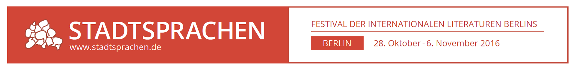
In 2016, the non-profit Berliner Literarische Aktion (BLA) held its first ever Stadtsprachen Literatur—a literary event and symposium in Berlin celebrating authors who speak different languages other than German. I had the privilege to serve as the Art Director, developing the event logo, branding, and creating a template for the website. I created a template for the website, while the creation and coding of the finished website was done by the BLA webmaster.
The Concept
Martin Jankowski, the chairman of the BLA, set these requirements:
1. He wanted a logo that omitted any of his standard associations with literature, such as pens, publications, typewriters, etc..
2. The logo should be abstract as well harken to the aesthetic of Berlin.
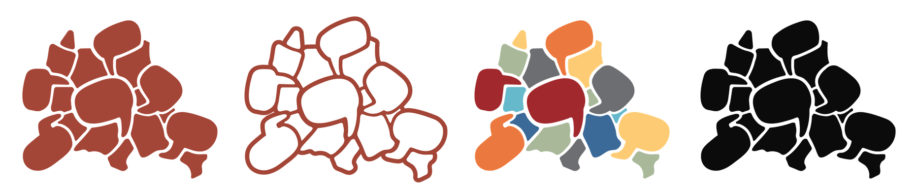
3. It should demonstrate different elements coming together.
With that in mind, I got started by exploring Berlin!
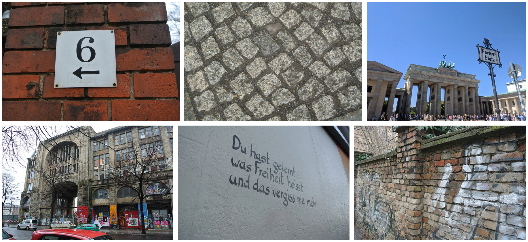
Beyond my immediate reaction to how beautiful Berlin is, I was struck by how old it still felt, not just through its history but through its buildings and structures. This was exemplified by the cobblestone pathways you could find everywhere, as well as the many brick and stone buildings. The history was easily felt.
The other takeaway I had was the almost quilt-like nature of Berlin. Exploring different areas, you could really see how Berlin is a rich and diverse tapestry of different people, elements, and demographics coming together to make this beautiful whole.
The Logo
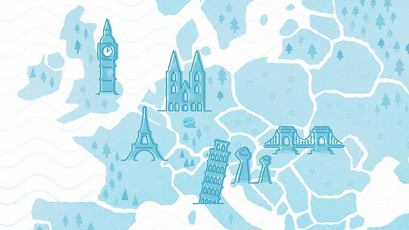
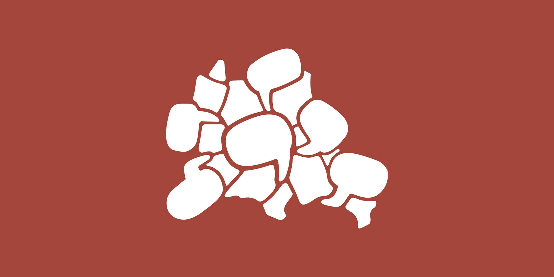
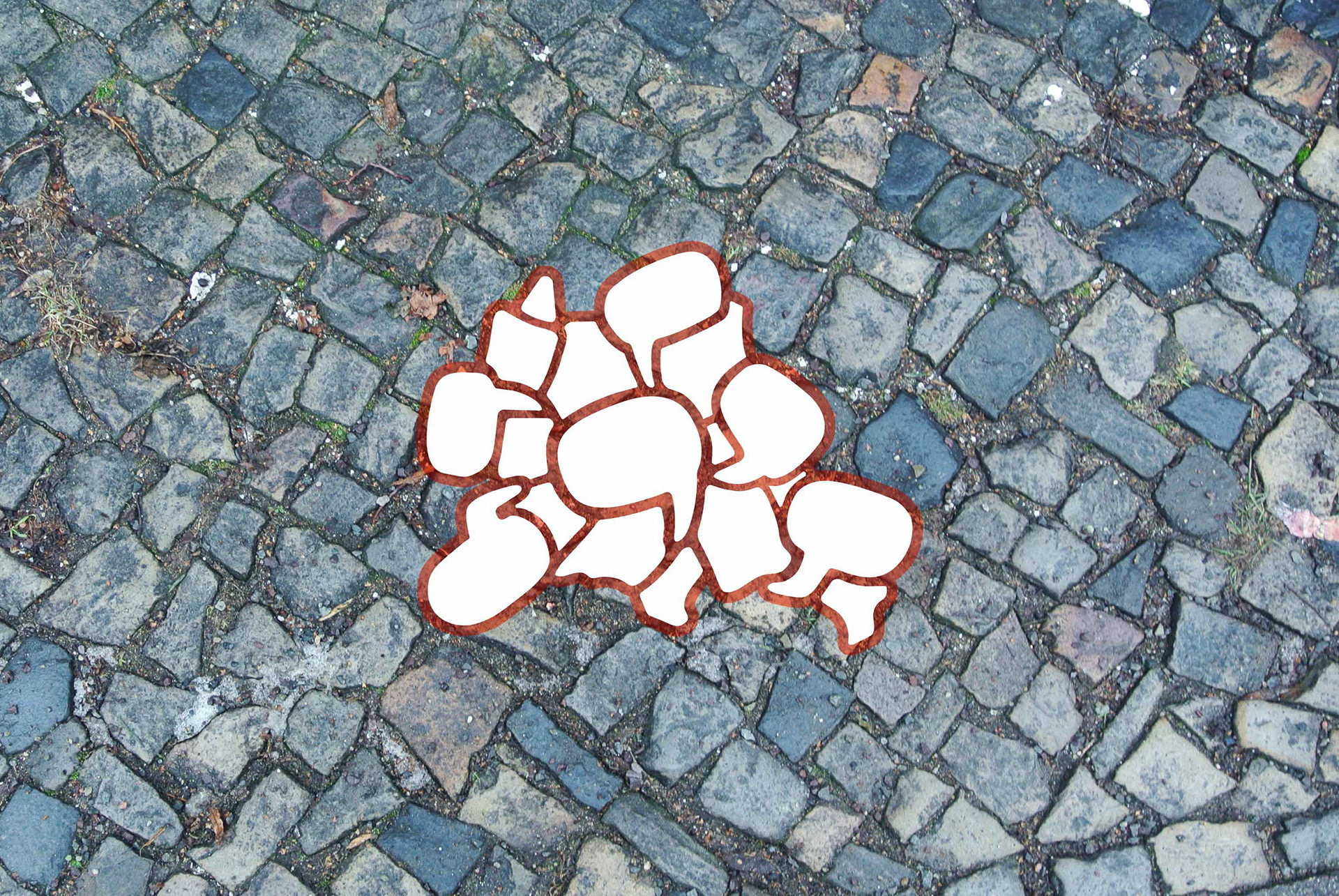
Drawing from these insights, the Stadtsprachen logo harkens to the aforementioned cobblestones found on the streets of Berlin. These forms, some of which take the shape of word balloons in reference the language aspect of the program, come together to create the shape of Berlin.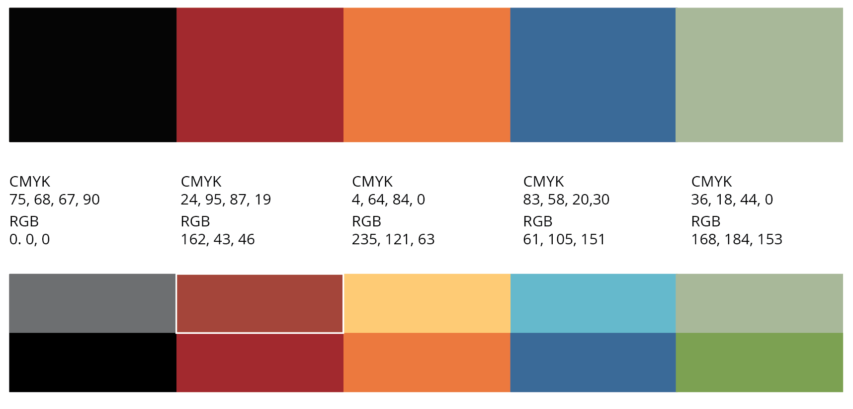
Four variations of the logo were created—a dark red version, a knocked out version, a variant using our established color palette and a simple black version for any black-white printing. The reds used in the main logo, one of our expanded palette colors, was chosen as our main color used because it evoked the brick buildings and the more industrial areas used by cultural arts centers such as the BLA in Berlin, as well as to emphasize the established tile-and-stone nature of the logo.
Above: the primary and expanded color palette for Stadtsprachen branding. Below: the logo in a lockup for a letterhead.
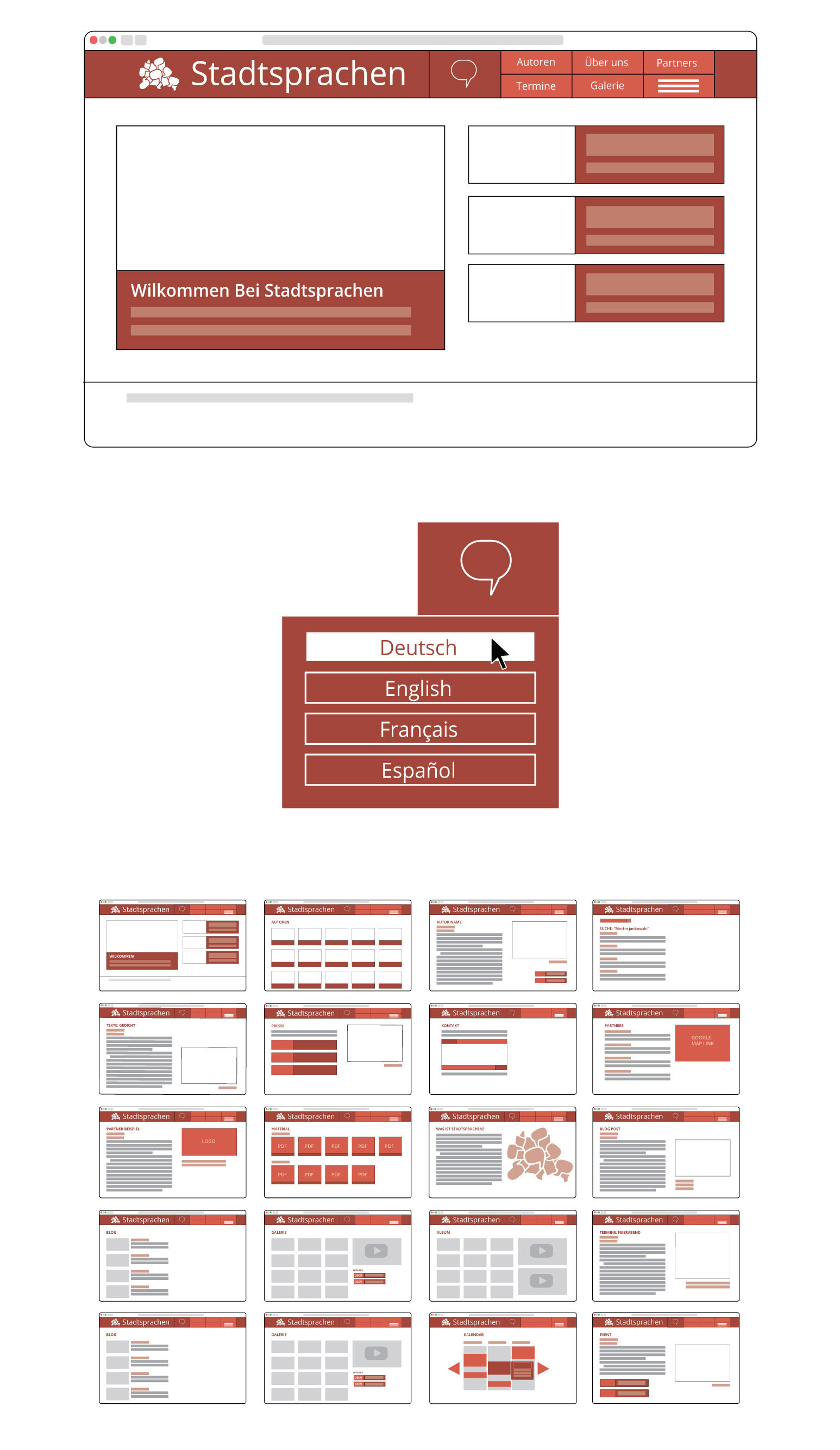
The Website
I created a template for the Stadtsprachen website, while the coding of the finished website was done by the hired BLA webmaster. It was important to Martin that we created a simple website for blogs and events that would be easy to use and understand by visitors of all ages.